DESIGN PROCESS
PHASE 1: THEME IDEATION
Overview
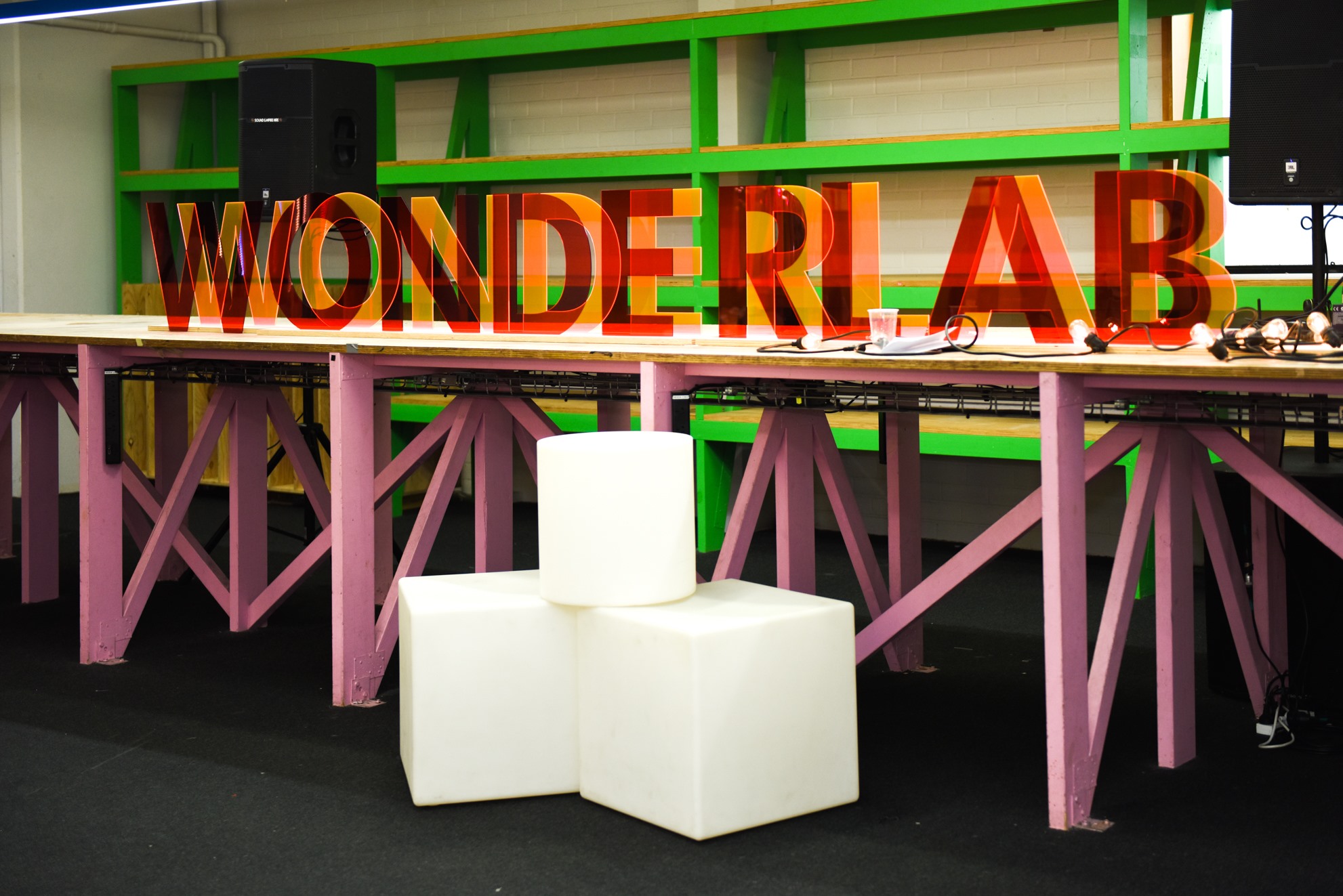
In laying the groundwork for the Exhibition, a team of Sydney students coalesce to discover an overarching theme. This year’s exhibition theme is play, transforming Homebase into the ‘Wonderlab’. We aimed to create a space where guests could experience wonder and big ideas, bringing the community together through playful experiences.
The exhibition team is set up by issuing students with responsibilities of Marketing, Branding, Curation, Catalogue and Website. At that, we task graduating students with documenting their final work to create an accompanying catalogue, website and on-the-floor demonstration.
As part of my graduation show team, I chose the responsibility of developing a website that would show this year’s graduates, exhibited projects and information about the event. I would be working alongside my teammate (Abhinav) who also volunteered to be a part of the web team.
Concept Exploration
Theme inspiration and ideation
In the pre-production phase of event planning, we explored various artistic styles that coincided with the theme of play. We eventually came to a consensus, that Bauhaus design best matched the soul of the event after looking at alternate directions such as neon design or flat design. With the artistic direction established, my first inclination was to analyse and compile existing sites and Pinterest boards that would influence the structure of the D19 website.
Web design and layout
Before sketching initial wireframes of the exhibition site, it was imperative to look at previous graduation sites to learn and improve upon needed improvements. I categorised the issues into 3 main points after a deconstruction and analysis of events prior to this years.
1. Difficulty in determining which students were a team.
2. Little emphasis on what projects were worked on by whom.
3. There was no way to filter or organise projects.
Low Fidelity Prototyping
Final Deliverables
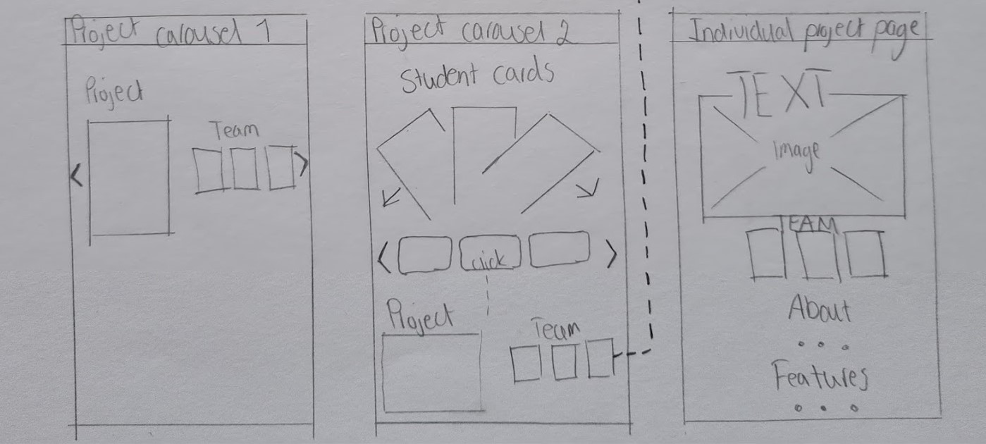
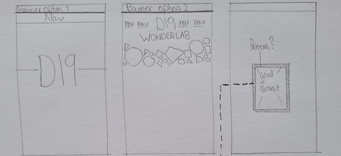
I began low fidelity sketching, keeping the 3 main issues in focus. When sketching I experimented with various banner options, carousel options and project page options. The main focus was to initialize the basic structure, style and layout of the pages; hence I did not show the flow between pages at this stage.
Low Fidelity Wireframing
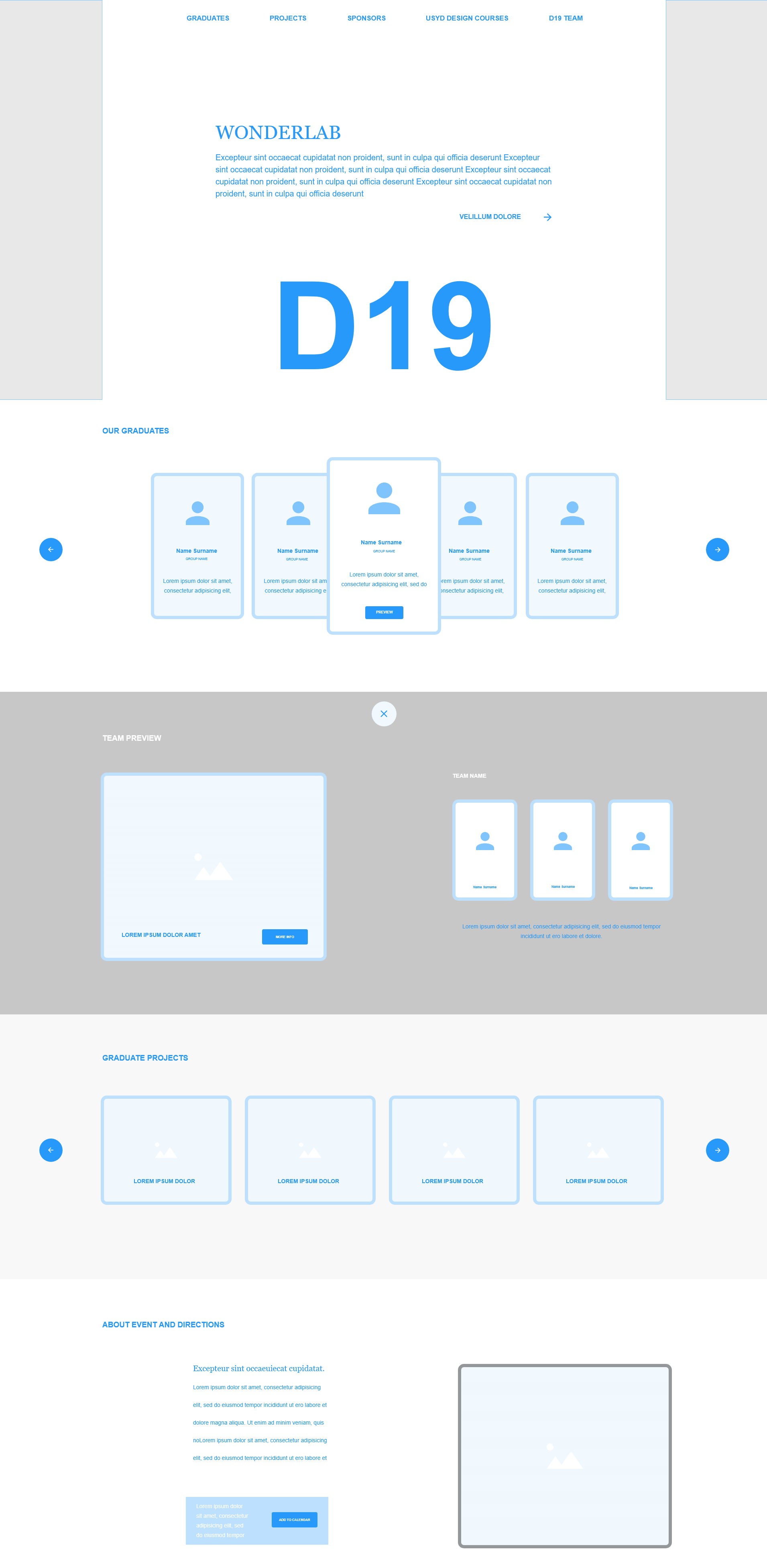
At this point in the design process, I outlined the flow between screens, as well as its structure. The D19 homepage would incorporate a card-style layout, specifically for carousels and students’ projects and student profile sections. To differentiate between teams and their projects, each group would be designated a unique border pattern.
At this point in the design process, I outlined the flow between screens, as well as its structure. The D19 homepage would incorporate a card-style layout, specifically for carousels and students’ projects and student profile sections. To differentiate between teams and their projects, each group would be designated a unique border pattern.
Keeping in sync with the curation of the show, an on-hover effect would be utilized to mimic the coloured vinyl used on windows. Potential geometric accent pieces and hero section banner designs showed aesthetic directions the site could take. A filtering system improved organisation and search by filtering projects by brief and design type, further demonstrated an improvement of the
D18 website.
PHASE 2: Conception
High Fidelity Prototyping
High fidelity design iteration
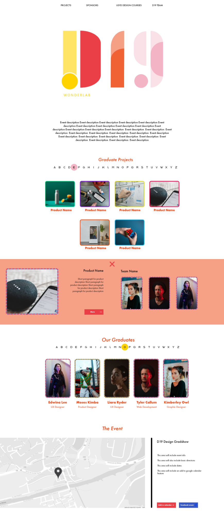
Both my teammate and I pitched our designs to the entirety of the group. In response to feedback from the team, the decision was made to create an amalgamation of both my designs and my peer’s designs. We updated the design where both the student profile section and project section changed from a stacked layout to separated cards. Rather than utilizing a sliding carousel, projects and students were now categorised by an interactive alphabetical selection tool.
One feature that required iteration was the feasibility of the various border patterns. A rework of the border design was needed to better distinguish between designated patterns. The decision was made to eliminate the border pattern idea entirely and instead solely rely on a hover overlay. Apart from that, designs for the sponsors' page, D19 team page and course overview page were required as final requisites for the site.
D19 logo animation and teaser site
In the days following the creation of the high-fidelity mock-ups, we began work on a teaser website to spark interest in the event. We divided the major requirements for the site into two. While my teammate was responsible for coding, I worked on the D19 logo animation.
I intended to create an animation evoking a sense of playfulness while retaining an outlook of professionalism. I decided on creating a coloured trail animation, where two spheres collide to form the D19 logo. As the logo progresses from lines to shapes, they move in a way that closely resembles pinwheels. The trail effect is created by overlapping multiple logos of differing theme colours and introducing them at timed intervals. Overall, I faced two main issues.
1. Initially, there were importing issues from illustrator to After Effects. The logo had to be recreated within aftereffects, as each logo segment would not retain its own individual shape. This was necessary to ensure various parts of the logo move at their specific times.
2. The second issue was the timing of the separate colour trails. Numerous hours were dedicated to separating the individual trails equidistantly in the hope of creating a structured and succinct animation.
.gif)
PHASE 3: WEB DEVELOPMENT
Web Implementation
Website Coding
The immense challenge of the site necessitated distribution of the workload. My teammate was responsible for the home page, whereas I was required to code the individual project pages.
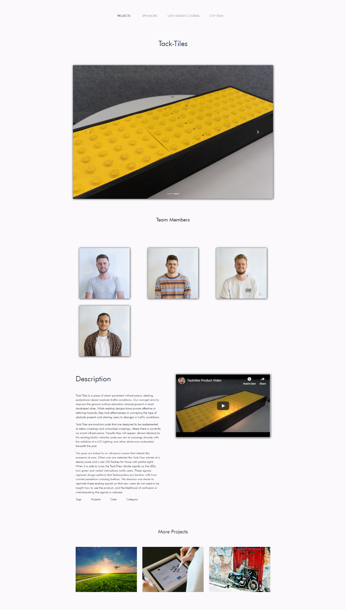
I began coding the individual project pages by starting with basic bootstrap elements using Bootstrap Studio. The advantage of Bootstrap Studio lies in its ability to offer prepackaged code that already incorporates resizing properties and responsiveness. I then edited and implemented code, so that the overall layout matched the design aesthetic. Namely: A project image carousel, individual team images, project descriptions and linked exhibition projects.
To replace the scrapped border pattern idea, I manipulated an on-hover feature package to utilize a geometric shape and make use of the D19 colours. Unfortunately, I decided to mitigate the use of unique individual team based on-hover patterns, as it would have required complex calculations within the java scripting code and taken up too much time.
We reached out to students in our local building to get their perspective on the design of the homepage. The general consensus was that too much data was being inundated onto them and everything feeling sluggish. The decision was made to move the student profiles and projects onto separate pages, to account for not only home page loading times but also so that website users aren’t overwhelmed by an endless list of students and projects.
Final High-Fidelity Mockups
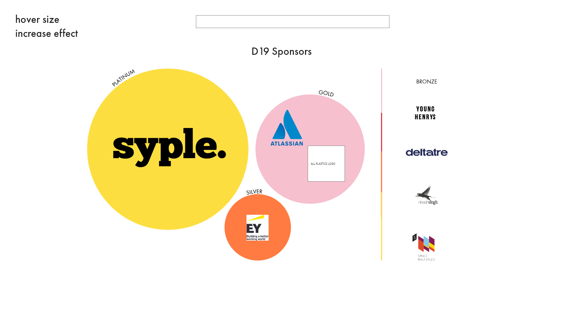
The final aspects of the website called for the design of the sponsor page, team page and the course overview page. Using Adobe XD, I took inspiration from designs made available from the branding team and applied them to the Sponsors page. I created three designs, that utilised size varying geometric shapes to separate each sponsor accordingly.
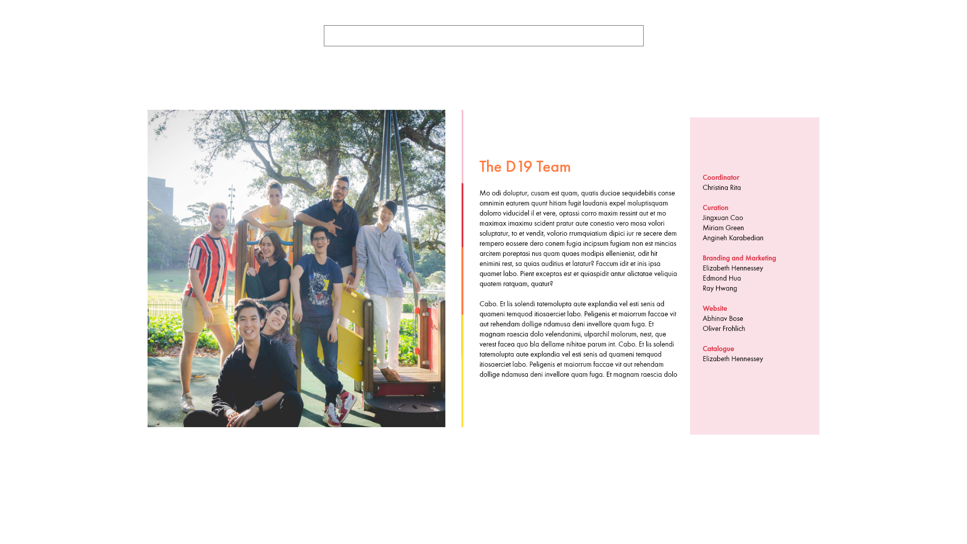
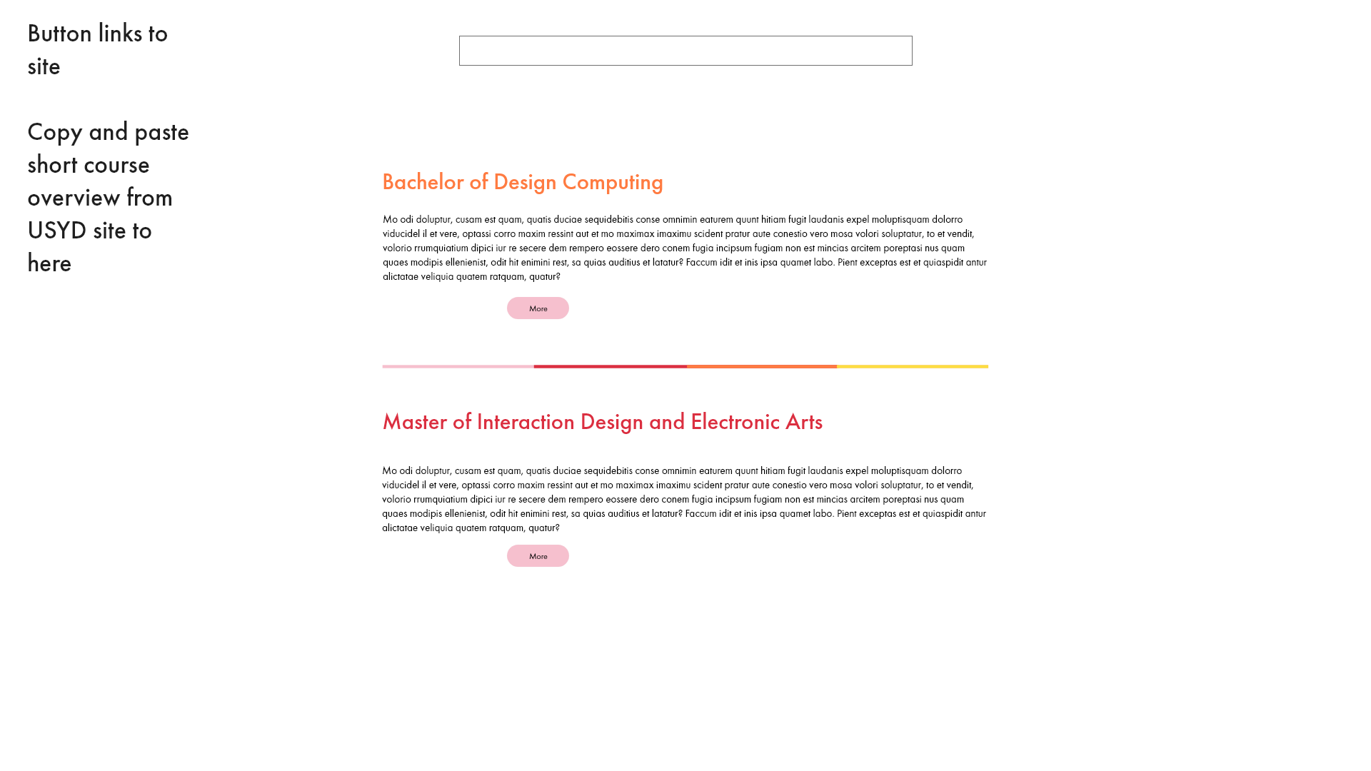
The course overview page showed a summarized description of the Bachelor of Design Computing and Master of the Electronic Arts degrees. Furthermore, high-fidelity mockups showed the first iteration of the D19 team page, which would later incorporate a quote and image of each student involved.
Data Entry
Data entry proved most challenging throughout the website curation process. A vast amount of time was required to compile student data, project photos and student photos within their own individual project page. With all the data derived from forms sent out to students, various inconsistencies could be noted and had to be resolved. As an example, some students did not state what projects they were responsible or the team they were a part of. Also, various project images were not uploaded by some students.
Fortunately, a team member from the catalogue team sent a list of projects, that included the affiliated team members, which made the tasks significantly less taxing. Some minor issues involved resizing vertical images so that sliding carousels would not span the entire length of the web page.
.png)
.png)
.png)
