DESIGN PROCESS
PHASE 1: CONCEPT IDEATION
Overview
We laid out numerous options for the direction of the project. Namely, autonomous crop harvesters for farmers, a rural postal delivery service to fill in the gaps left by traditional services, and delivery drones that would operate between a network of peers. We decided to go with the peer-to-peer delivery drone concept, as we felt there were vast opportunities in creating an exciting and useful service for personalised deliveries.
Problem Statement
In the context of a city, it is currently costly, time-consuming and inefficient to transport items across short distances. The current method to deliver a small item from one suburb to the next involves transport via a vehicle with a weight which far exceeds the weight of the delivery, requiring costly fuel and increasing levels of city congestion.
Background
We decided to make use of a variety of research methods to gain a higher-level understanding of verifiable user problems and user needs. Our intention was to discover the ways in which people will interact with delivery drones in the context of today's shared economies. Overall our research objectives were as follows:
1. To identify if there is a need to deliver small packages faster than existing services.
2. To determine the reasons that a user would be likely or unlikely to use a drone delivery service.
3. To determine what functionality a user would want from the final interaction.

Survey
A public survey was sent out to participants, via a number of channels, to analyse how people perceived drone technology and assess their use of existing peer-to peer applications. It also explored how people currently transport items and how they would use delivery drones.

Interviews
Subjects from different groups and occupations undertook semi structured interviews. The concept of delivery drones was described to participants and interviewed using a loose structure. Follow-up questions differed according to individual responses, allowing for more tailored, personalised insights.

Secondary Research
We conducted secondary research, reviewing academic journals and government data relevant to our chosen and technology. This allowed us to develop a more informed understanding of the technical uses and limitations of current and future attempts to solve the problem.
Research Insight
In reference to an academic article on the public perception of drones, we noted some interesting insights. From a survey of randomly selected participants from different age groups, it was concluded that people are significantly less concerned about military or police drones than they are about commercial and hobby drones. The survey was designed to collect quantitative data about how people felt about having to travel to pick up something left behind, as well as how people would perceive drones as a form of delivery. We also gained insight into which forms of peer-to-peer services were used most frequently by our survey participants.
Overwhelmingly, all users expressed some form of negative emotion when asked how they felt having to travel to pick something. No users responded with happy or neutral emotions. This suggests that drone technology could prove effective in having to transmit items quickly and without human involvement. Additionally, all of our recorded participants had used more than one peer-to-peer application, with uber eats and Airbnb being most popular.
During the interview, we described the concept and its use cases to our participants. We then asked a series of questions, letting the conversation flow naturally, recording audio and taking notes by hand. Most notably we concluded, that with the exception of one participant, interviewees would use drones as a delivery service if it worked well. On the other hand, there were some concerns about safety and noise pollution.
Findings Summary
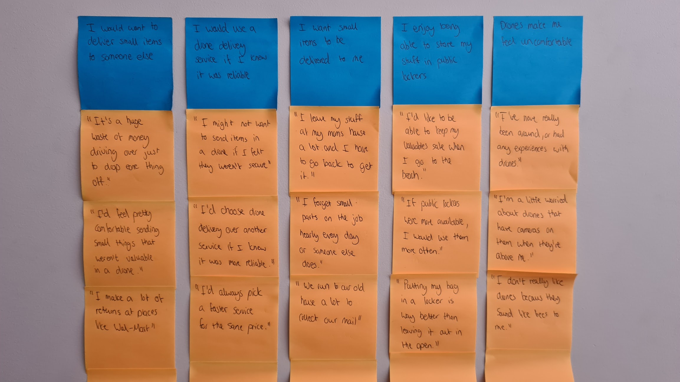
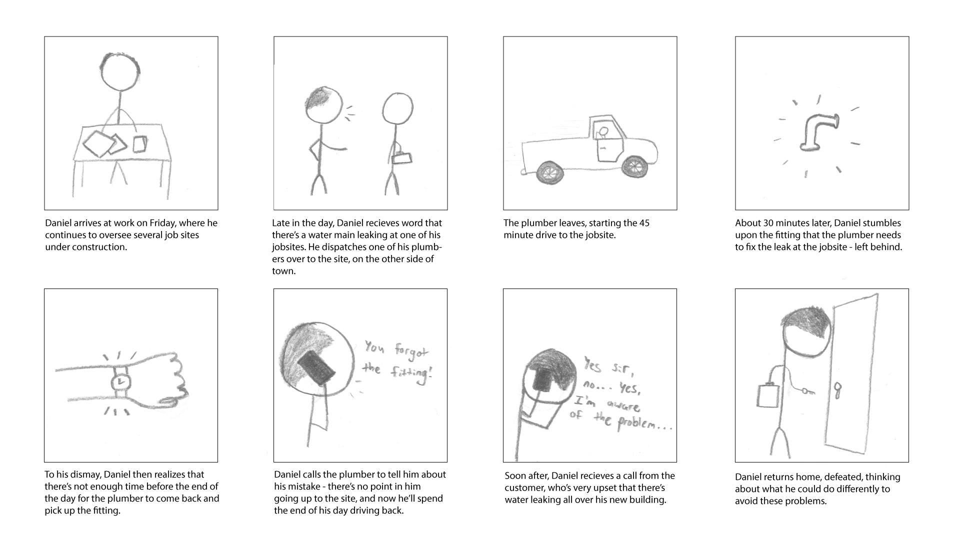
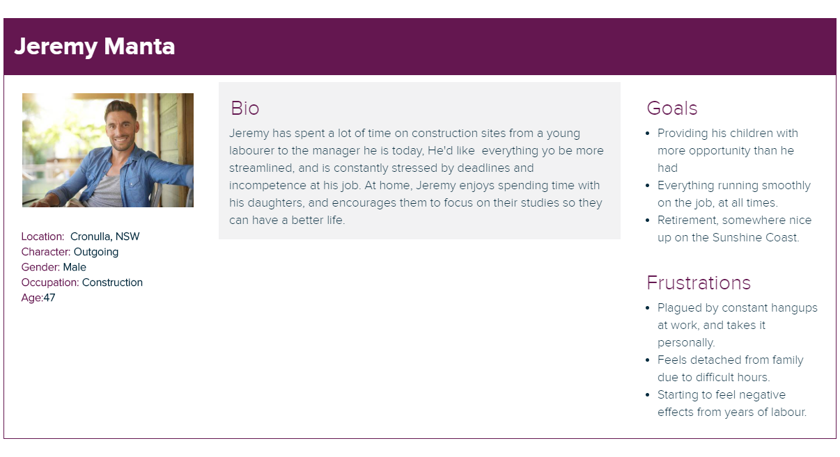
With the entirety of our data collected, we used a variety of evaluation methods to form a clear consensus. We transposed information from our interviews and survey into an affinity diagram. As a result, we were able to develop a set of personas representing different use cases for the product, and created storyboards walking through each persona’s unique use case.
Analysis
Desire
There are unmet user needs in the current system of deliveries. Small items, that only need to go a short distance, often face more complications than larger deliveries. Users also want faster deliveries, that are cheaper than existing services.
Safety
An overwhelming majority of users said they would unlikely use a drone delivery service if they didn't feel like it was safe. This new service must reassure concerns about security, noise, or personal injury.
Assurance
Users want transparency about how their delivery is taking place, and assurance that it will arrive at its destination in one piece and without delay. Users will be extremely unlikely to use a service like this if they don't feel it is completely reliable.
Storyboard
Persona
PHASE 2: CONCEPT IDEATION
Low Fidelity Prototyping
Low Fidelity Sketching
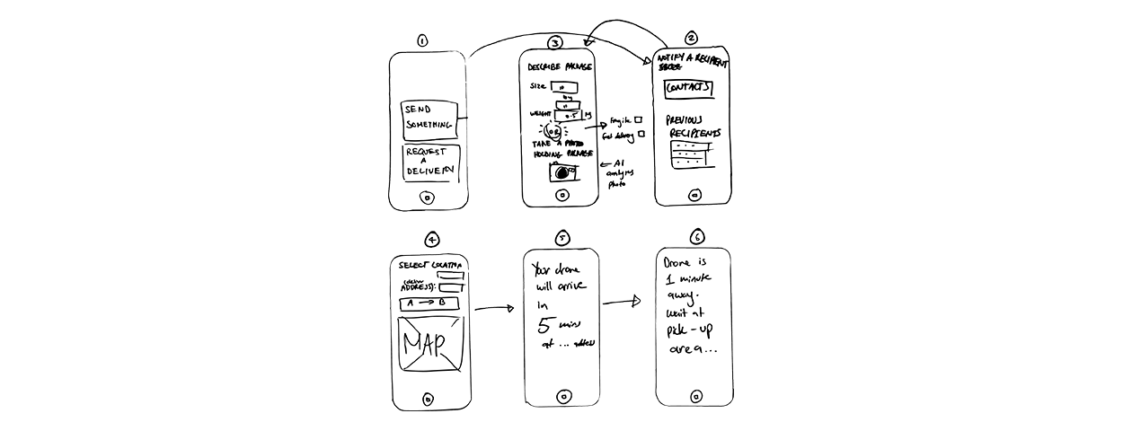
Our first sketches showcased an initial idea of how the interface would function. It represented the basic steps users would take to progress through a delivery request, functioning more like a user journey rather than a functioning user interface at this point. We experimented with tiered solutions based on packaging weight, as well as methods of feedback during the dispatchment, packing and arrival of the drone. This interface would serve as a basic starting point for moving forward with our visual design of our UI, as we did not test this interface with users.
Low Fidelity Wireframing

Refined from the previous concept, these prototypes provided the first testable version of our interface. This iteration provided a good base for information architecture, representing the steps users would take to order a delivery drone. Included in this prototype were concepts such as package size selection, delivery address selection, and live delivery tracking overlaid on a 2D map. A low fidelity prototype also helped us begin to understand our pain points, which we looked to similar services, like Uber, for already proven design patterns.
Low Fidelity User Testing
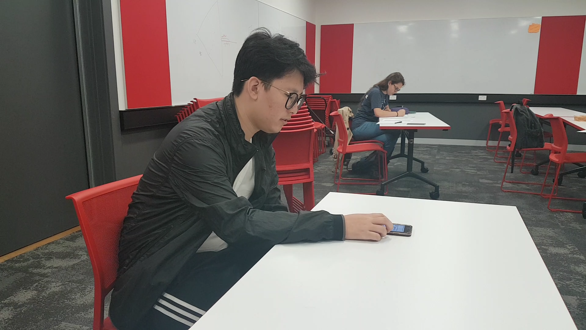
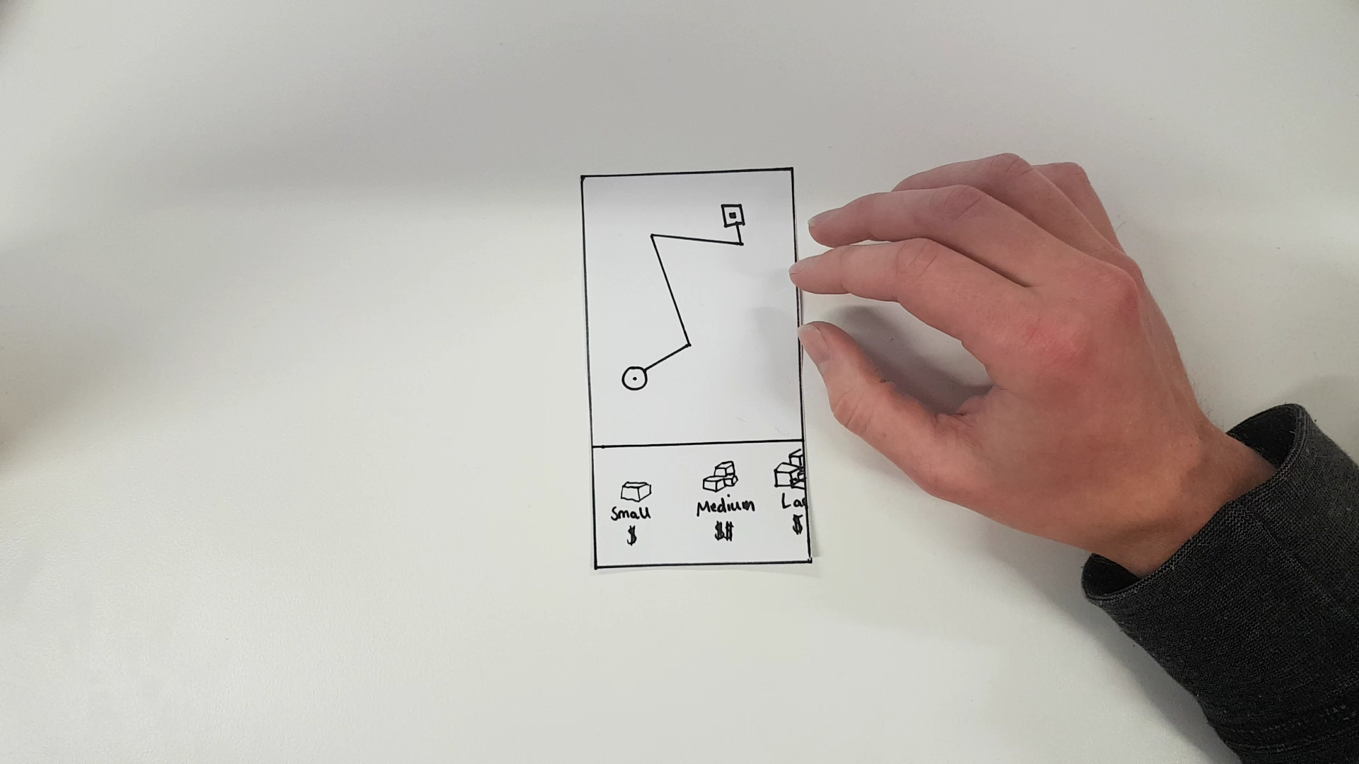
We tested the first iteration of the app by implementing our user interface in Marvel Pop, which was a quick and easy way of creating clickable interaction. Additionally, we printed our interface so that users could tap on the cards, manually changing the screens. The testing in this stage was conducted through a think-aloud session in which users needed to progress through the main steps of the design. This provided valuable data regarding what we expected users to do vs the actions they performed when they used the app.
Strengths
The ability to reschedule a recent delivery without having to repeat the entire process.
Navigating from a central map screen, likely due to it being a repeated affordance from similar mobile apps.
Having favourited locations for easyre-delivery.
Weaknesses
No confirmation before ordering and a lack of a way to review a delivery.
Unclear delivery tracking, as users had no idea what stage of the delivery process their drone was at.
An overall lack of necessitated features in providing users with a good delivery experience, on par with other peer-to-peer services.
In summary, the prototype we had designed had not been built to the fidelity that it required to be fully functional, both in the sense of providing a wholistic drone delivery experience, as well as being able to evaluate that experience. This was our main consideration when moving forward to the next phase of prototyping.
Mid Fidelity User Testing
Moving forward from the previous iteration, we updated our design to into two mid-fidelity prototypes. The designs offered greater sophistication that was needed to demonstrate a fully functional delivery application. This included location pins for each contact, a dynamic map with a visible drone icon and status updates, a size and price confirmation screen, and a search bar for delivery selection.
We used the following evaluation methods to study user interaction with the updated prototypes, discover pain points, and improve the usability of our service.
A/B Testing
Two separate versions of our product, each representative of a different user journey, allowed us to test them against each other to determine their strengths and weaknesses. This method also allowed us to understand the impact of specific changes between the two versions.
Think out-loud
The advantage of Think-Aloud testing was the ability to diagnose user problems as they occur. Users articulating their first thoughts as they move through wireframes allowed for quick diagnosis of user interface problems.

Heuristic Evaluation
A heuristic evaluation was used to identify the cause of pain points and how they could be solved. The priority of this heuristic analysis was to identify how severe the problems were and how often a user was agrevated as a result of the problem.
Heuristic Evaluation 1
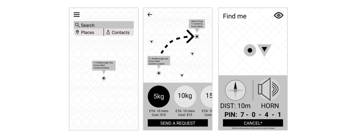
Strengths
Visibility of system status
At no stage is the user unsure of what is happening as either the design pattern describes what to do, i.e. the search page, or they may read the top of the screen to figure out what to do next.
Match between system and the real world
The map displays a strong correlation between the physicality of the user in the real world and the user’s digital presence.
Error prevention
There was always a way to take a step back in
the process, allowing cancellation if a mistake was made.
Weaknesses
User control and freedom
Users may not know the specifics of their package such as its size and weight and may struggle to specify this information.
Consistency and standards
This wireframe uses a variety of methods to convey the same information, e.g. the ETA being written in several locations on the same page.
Recognition rather than recall
The only way for the user to know that the cancel button will send them back to the home screen is for them to cancel and remember next time. This isn’t optimal for the user.
Heuristic Evaluation 2
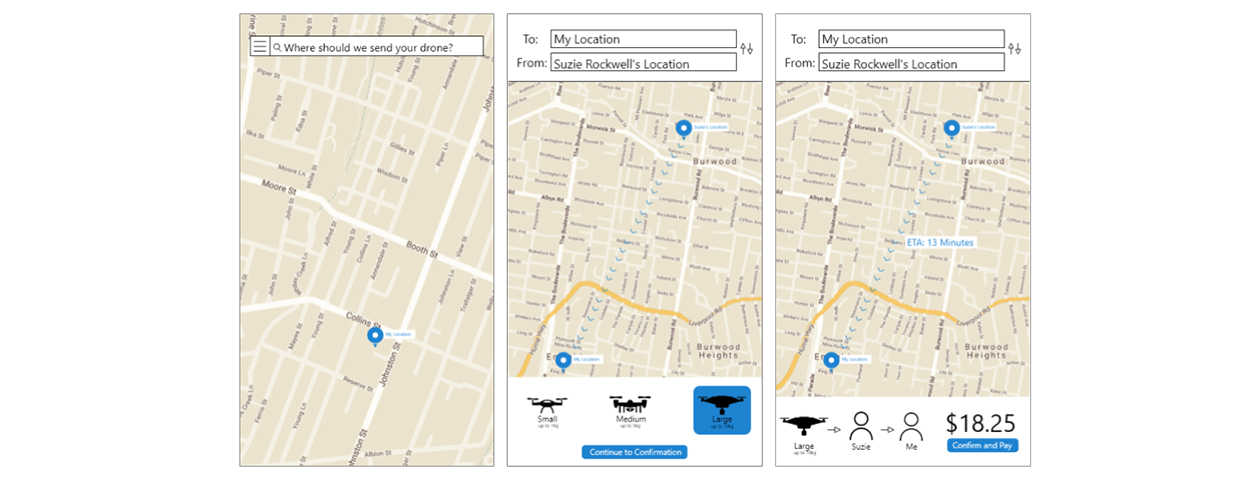
Strengths
Visibility of system status
The application informs the user of the drone’s location and ETA throughout the duration of the delivery, alleviating the worry of not knowing what it is going on.
Match between system and the real world
The application strikes a balance between an informal and formal tone, as users should be sincerely informed about the journey their personal items will be subjected to.
Recognition rather than recall
The user will be given a selection of their most-frequented drone drop off locations. Moreover, if the user chooses to manually input an address, the location can be autocompleted making it easier and faster to input data.
Weaknesses
Visibility of system status
Some users want a more detailed breakdown of the ETA. Rather than only displaying the total delivery ETA, times between milestones within the journey might be beneficial to both the sender and receiver.
User control and freedom
The wireframe does not allow the user to cancel or move back to the previous screen.
Consistency and standards
Item drop on and drop off icons on the screen are identical, which is confusing to users. Drone tiers should incorporate colour and differing iconography, on map, to allow for a clearer distinction between a change in drone tier.
Think-Out-Loud Testing
For think out-loud testing, we decided to further test the functionality of our application by bringing it into the physical world. We asked one user to deliver a hat to another, playing the part of the drone with a cardboard box to demonstrate how it would work when fully functional. This proved extremely useful, as we were able to see the physical pain points that existed outside of the digital interface.
.png)
Strengths
Ability to swap sender and receiver using a single button during the delivery process.
Improved affordance of drone location and directions during delivery.
Being able to view a summary of your order details before you pay.
Weaknesses
Package size selection. Users don't know the weight or dimensions of what they want to send.
Users felt confused about the pin system. Users wouldn’t be able to read it in the dark or always remember their pin.
Searching by address instead of by contact became redundant, as a person needs to be present to put the item in or take it out of the drone.
Several pain points were realized in the existing application that needed amending, comprising of confusion over how contacts differed from addresses, uncomfortable screen interactions, and lack of clarity in the way ETA information was being displayed. The team would overcome these issues in the final steps of the design process.
PHASE 3: FINAL DELIVERABLES
High Fidelity Prototyping
We decided to run with the second set of wireframes as our base, creating a new theme and adding a culmination of improvements that were carefully considered during the evaluation process.

Search Bar
From our testing, users commented on the search bar being too high up on the screen and uncomfortable to reach. The solution was just to simply move the bar from the top to the bottom of the screen.

Contacts
Users expressed that they'd like to be able to see where their friends are on the map and be able to differentiate themselves from other contacts. We added each contact with their initials to the map with an option to start a delivery.

Address Selection
Peer to peer drone delivery is peer to peer, not address to address. A person will need to be present when inserting or extracting items from the drone. We abandoned the old system in favour of delivery by contact. The search by address feature is still included but as a fallback method.

Item Size Selection
Users usually don’t know the dimensions of their item - so asking them to select a drone-based on an items numerical size and weight proved difficult. Instead, we’ve introduced a slider, cycling through common items from smallest to largest that the drone can carry. This allows the correct size drone to be selected in the background, without the user having to know any dimensions.

Drone Route
Users were confused by the way the route of the drone was being displayed. To fix this, we opted to display the entire route the drone will take, provide an ETA at the bottom of the screen, and add animation to the movement of the drone.
With the fundamentals of the prototype restructured, we decided to move forward in creating our final interactive prototype. This would include implementing the changes detailed above, reworking the colour scheme, and adding animation and transitions to help highlight the interaction.
The Final Design
The final prototype was created and animated using Adobe XD, allowing the team to design and animate simultaneously. We’ve recognized that animations were fundamental in conveying the functionality of some of the main elements of the app - whether it be in showing which way the drone is moving, or the difference in item size. Overall, we were able to achieve an extraordinary outcome and were very impressed with the look, feel, and overall quality of the final interface.